Quick Summary: Gray rooms often feel flat, but gray coloring books provide a quiet, structured activity that removes color choices and directs attention to the process. Research shows brief, mindful coloring-like 10-minute sessions-can ease perceived stress, though it’s not a fix for burnout. The best books use subtle gray guides and white space to avoid visual overload, letting users focus on strokes and rhythm. Soft Ink Press emphasizes this balance, making monochrome coloring feel intentional rather than restrictive.
Gray rooms now tire many people, yet gray coloring books offer a quieter, bounded task. They remove color choices and give hands and attention one clear job. A 2022 trial with 77 Hong Kong nurses supports coloring for brief stress management, not gray as a cure. This evidence-led guide explains why gray coloring books, calm coloring pages, and monochrome art books may feel different from gray-interior fatigue.
Why Gray Became Both a Safe Neutral and a Source of Fatigue
The appeal of visual restraint
Gray became a go-to because it feels calm, flexible, and easy to pair. It lets furniture, art, or a bright throw do the work. A New York Times feature still shows gray, black, and white used for a clean, quiet home.
Tip: Treat gray as a base, not a rule. Add texture, light, and one personal detail.
When neutrality becomes monotony
Too much gray can feel flat when every wall, rug, and object has the same low contrast. The backlash behind “sad beige” interiors shows people want rooms with more character, as The New York Times reported.
| Gray approach | Likely feel |
|---|---|
| Mixed shades and textures | Soft and layered |
| One flat shade everywhere | Dull and repetitive |
Soft Ink Press pages keep the calm of gray while leaving white space for your own color choices.
Also Read: Botanical – softinkpress.com
What Research Actually Says About Coloring and Stress
The strongest case for a short coloring ritual
Coloring can give your attention one small, repeatable task. That pause may help you step away from racing thoughts. In one randomized trial, nurses who practiced mindful coloring for 100 minutes over 10 days reported lower perceived stress than a waitlist group, though burnout scores did not change the trial report.
- Set a 10-minute timer.
- Put your phone out of reach.
- Color slowly, without judging the result.
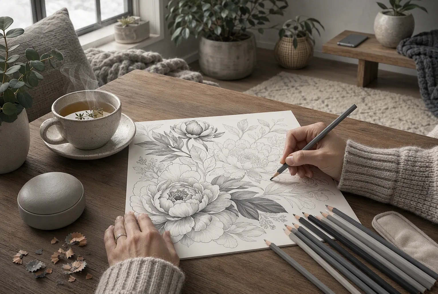
Treat coloring as a simple self-care break, not a replacement for mental health care.
Why gray should not be oversold
Gray pages may feel quieter because they reduce bright visual input and leave room for your choices. That is a design preference, not a proven stress treatment.
| What research supports | What it does not prove |
|---|---|
| Focused coloring may lower short-term stress | Gray tones work better than all colors |
| A routine can support mindful attention | Coloring cures anxiety or burnout |
- Choose gray if it feels less demanding.
- Switch styles if it feels flat or gloomy.
Also Read: Ultimate Guide to Choosing Monochrome Coloring Books for Adults
How Gray Coloring Books Turn Monochrome Into an Active Practice
Fewer color decisions, more attention to process
A gray palette cuts the pressure to match, shade, and choose. Pick one pencil, then notice the stroke, edge, and empty space instead. A small nurse study found mindful coloring was linked to lower perceived stress, but it does not make coloring medical care. The trial supports a simple, focused break.
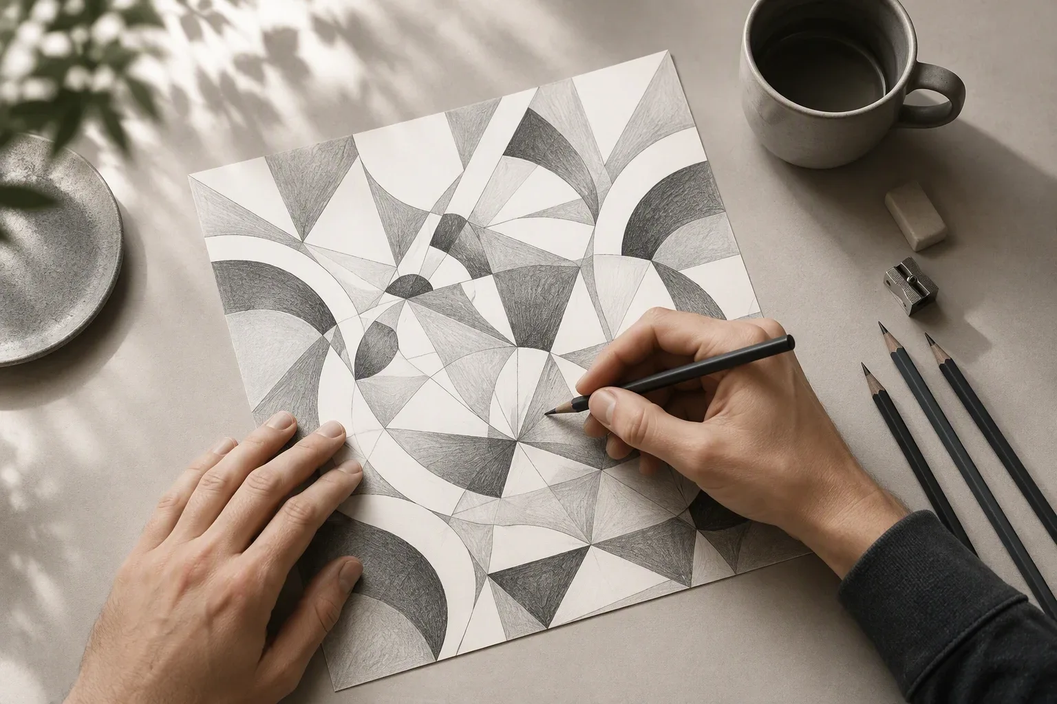
Tip: Color one small area for five minutes. Stop before it feels like a task.
Why page design matters more than the label
Look for pages with:
- Clear gray guides
- Open white space
- Varied line weight
| Design choice | What it supports |
|---|---|
| Soft outlines | Easy starts |
| Dense detail | Slow focus |
| White space | Rest for the eyes |
Soft Ink Press pages make the practice feel intentional, not strict.
Also Read: Articles – softinkpress.com
How to Test Whether a Gray Coloring Book Feels Calming
Set a timer for 10 minutes and color one page without music or scrolling. Rate your tension from 1 to 5 before and after.
- Pick two or three gray-guided pages with different detail levels.
- Use the same pencils or markers each time.
- Notice your breath, jaw, and urge to rush.
- Stop if the faint lines make you squint or feel annoyed.
| Signal | What it suggests | Next step |
|---|---|---|
| You feel settled | The page suits your pace | Try another design |
| You feel stuck | Detail may be too dense | Choose wider spaces |
| You feel nothing | The format may not fit today | Test a different activity |
A small randomized trial of mindful coloring found lower perceived stress in one nurse group, but coloring is not medical care.
Choose a calmer creative break with Soft Ink Press. Its soft gray guides and open space make monochrome coloring feel intentional, not dull.
Frequently Asked Questions
Q1: How can monochrome coloring books help reduce stress from gray interior spaces?
They offer a small, active break from a muted room. Choosing shades and filling open space can hold attention gently. It is not medical care, but it may feel calming.
Q2: What are the psychological benefits of gray tones in coloring books for mindfulness?
Gray removes pressure to pick perfect colors. It can help you notice line, shade, and pace. Results vary, so treat it as a mindful hobby.
Q3: Why do Soft Ink Press monochrome coloring books emphasize intentionality over color?
Soft Ink Press uses soft guides and white space to support slow choices. The aim is personal focus, not a bright final page or strict color rules.
Conclusion
Gray coloring books offer calm focus without visual overload. Evidence suggests mindful coloring may reduce perceived stress, but it is not medical care, as this randomized trial shows.